stamping

MONDO RHODODENDRON

A while back someone asked if I could add our WA state flower, the Rhododendron to the mondo floral series. This set went through many (understatement, OY!) renditions before I landed on this . . . There are about 1,000 species of Rhododendrons. 😳

How in the world are you supposed to choose ONE to translate into a stamp??? The two outside my front door are kinda scraggly looking, but the ones next to my Mother-in-law’s house are ginormous, lush things, with vibrant fuchsia coloring! Her Rhodis make me think of giant floral pom-poms, LOL!

The Gold Finch is also the WA state bird, so it seemed fitting to include her—that flash of yellow is so bright and cheerful!

Clear embossed over black pigment ink , on my favorite Canson XL Watercolor paper and then watercolored with Gansai Tambi before die cutting it out.

I like the effect of the flower itself, repeated as a background to support the focal.

This time, the Rhodi was stamped in a softer pink color, with the Gold Finch mounted over top of it and a hexagon frame cut from gold foil card stock.

If any of you are Washingtonians, I hope this set holds a special place among your stamps! Also, did you know ALL Azaleas are Rhododendrons, but not all Rhododendrons are Azaleas???

I don’t know if that’s a “fun” fact, but it’s a fact . . . ROTFLMBO!

Also, a note of thanks to those of you who left a comment or messaged me via email about my previous post . . . XO∞

You’re the bestest!!!


Disclosure: Affiliate links to the products used in my projects, that I like and use may be included; I make a small commission when you purchase via those links, at no extra cost to you. Thank you for all your support!

SENDING HOLIDAY CHEER & HOLIDAY SPRIGS

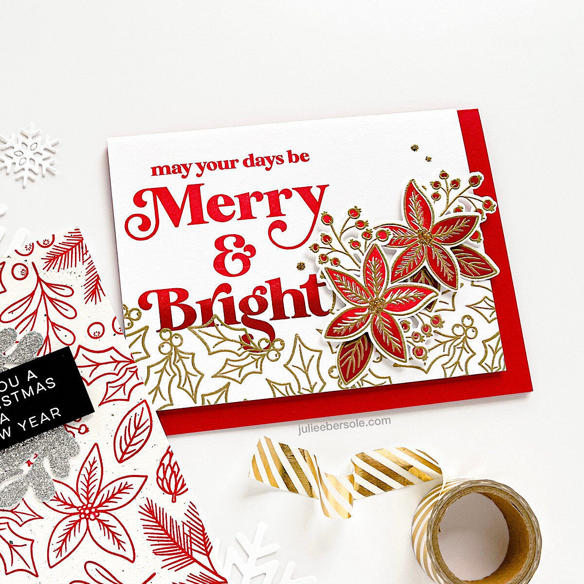
I’m always torn on color schemes for the holidays—not just for cards, but for holiday home decor, too; traditional vs. non-traditional . . . I do love red and white—especially a warm white—it just speaks cozy to me for the holidays. I have to laugh, tho, because at least on my cards I don’t have to “commit” with any permanency, LOL!

feat. Holiday Sprigs / Sending Holiday Cheer / “Wishing you a Merry Christmas…” from Holly Jolly Christmas

feat. Holiday Sprigs / Sending Holiday Cheer / “Wishing you a Merry Christmas…” from Holly Jolly Christmas

Sharing some samples today from the new 2021 Holiday Release that feature Sending Holiday Cheer and Holiday Sprigs. Now, I don’t show them on these particular examples, but there are some humorous quips in Sending Holiday Cheer that would totally bust me up if I opened a holiday card to find them inside. If that resonates with you, definitely take a close look at that set!!!

2021-holiday-WM-07.jpg

I love this ombré inking effect and couldn’t resist repeating that throughout a number of the samples I made for the release page. Holiday Sprigs has solid imagery to coordinate with outline counterparts so if you are not a colorist (like me!), you’ll be happy to have that kind of flexibility.

2021-holiday-WM-06.jpg

The outlines even look so pretty stamped simply in a rich red color against that natural white hue of watercolor paper. I added some fine spatters of black acrylic paint for just a tiny bit of texture and used one of the dies to cut sprigs from glitter paper to create a wreath effect—IRL the sparkle really sets off the whole design.

2021-holiday-WM-08.jpg

I was somewhat hesitant to try this on a darker card stock, but I think the white embossing looks stunning against this grey card stock, especially with the pops of red from the NUVO Drops—such a sophisticated, upscale look! I’m glad I tried it!

I’m so curious to know what other folks lean towards for their holiday colors!

Sidebar: Ellen Hutson is giving away prizes over on our Instagram Hop—if you’re so inclined to toss your name into the hat, go comment along the hop to enter! You can start at my Instagram or the Ellen Hutson Instagram account—just look for the hop graphic so you know you’re commenting on hop related pics!


ESSENTIALS BY ELLEN HOLIDAY 2021 RELEASE IS NOW LIVE

Click on the graphic above to go straight to the release page.

Click on the graphic above to go straight to the release page.

Have you determined what you wanna make for your holiday cards this year? Cuz you’re in luck today! The Ellen Hutson Holiday 2021 Release just dropped! We’ve got snowflakes, stockings, festive holiday botanicals, bold typography and some lighthearted snark for the insides of your greetings (HINT: take a close look at Sending Holiday Cheer on that release page; just sayin’ . . . ) that will elicit some laughs from the recipients of your creations!

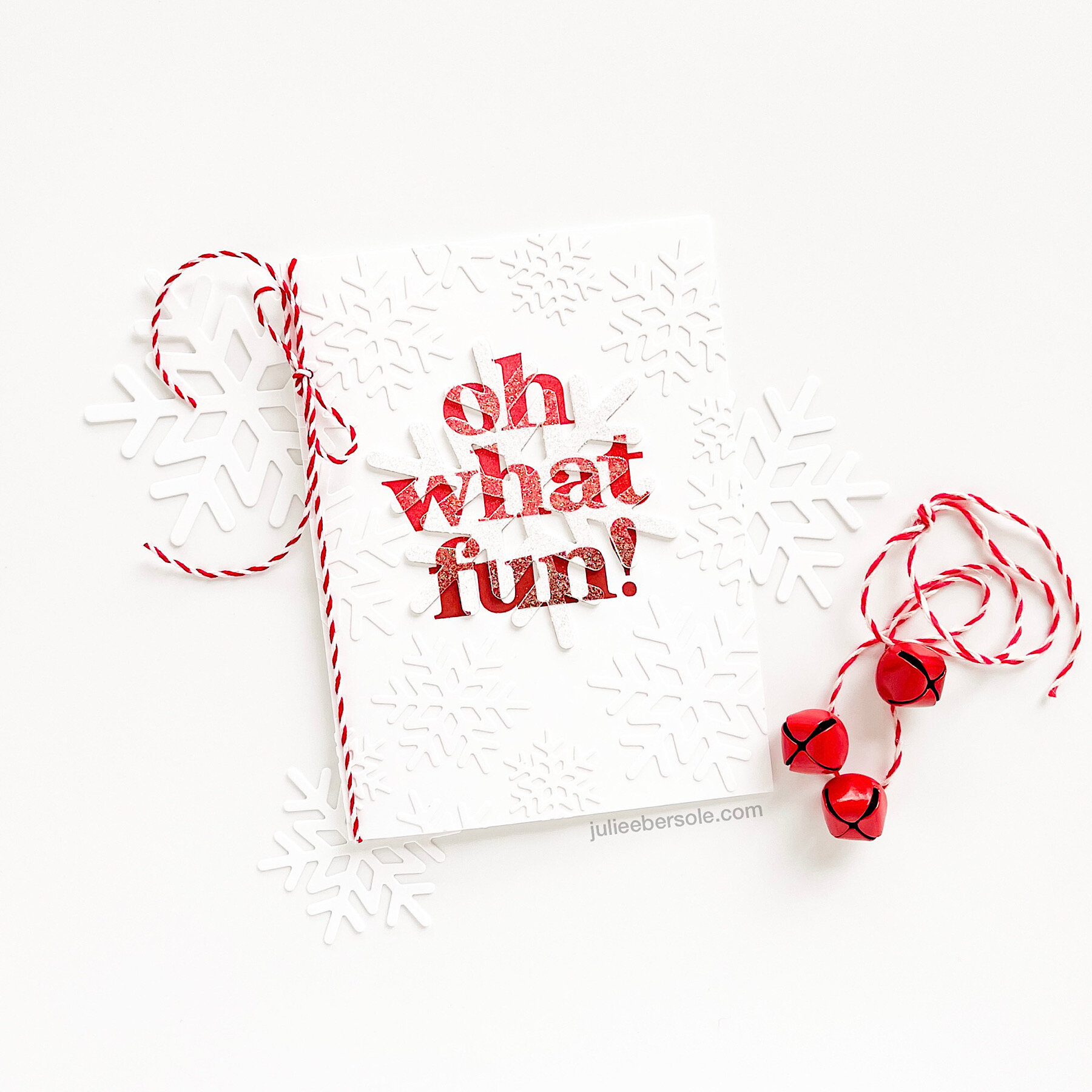
feat. Essentials Snowflakes Die Set / Oh What Fun Stamp Set (Gift with $75 purchase)

feat. Essentials Snowflakes Die Set / Oh What Fun Stamp Set (Gift with $75 purchase)

Today I wanted to highlight the Gift With Purchase Set “Oh What Fun”—I adore the modern lettering and how nicely it plays with this “eclipse” technique, using the new Essentials Sowflakes set (the largest of the set was used to create the eclipse, and the other sizes were layered all over to create a faux embossing folder effect!

“On What Fun” will be included with any orders of $75 at ellenhutson.com Oct 15-17 (while supplies last; please see the website for details).

The ombré inking effect on the sentiment was achieved by inking and stamping first with Rockin’ Red (a stamp positioning tool, like the MISTI, is key to creating this effect with precision), then inking the lower half of the sentiment with Peppermint Scrub, blending the edge with a smooth blending sponge, to avoid a hard line, and stamping again directly over the first impression. The end result will be a beautifully smooth transition from the red to the deeper almost wine hue. I’m a sucker for ombré . . .

If you’re not familiar with the “eclipse” technique, you can see me demonstrate it during a LIVE with Ellen that we did for Summer of Stamping. It’s definitely one of my all-time favorite techniques. Because easy.

As for the faux embossing folder effect? I have a tip for ya’:

Apply Stick-It Sheet adhesive to the back of your card stock BEFORE die cutting the snowflakes; then you can just peel and stick ‘em wherever you want on your card front all quick-like. When you trim off snowflakes that end up hanging off the edge of your card front, many of them can be positioned elsewhere you feel there are any gaps (along the outer straight edges). •fist pump•

I’ll be sharing more samples in the coming days—thanks so much for reading!


HALLOWEEN LOVERS UNITE!

We’ve always especially loved Halloween at my house; it also happens to be the Mister’s birthday! (cue the confetti—Halloween confetti, of course!) I’ve been sharing sneak peeks on my Instagram but I know some of y’all don’t use Instagram, so I’m sharing here, too. If you wanna throw your name in the hat for some great prizes, check out the Instagram Hop we have going on (this post has the details and you can visit the other stops from there!)

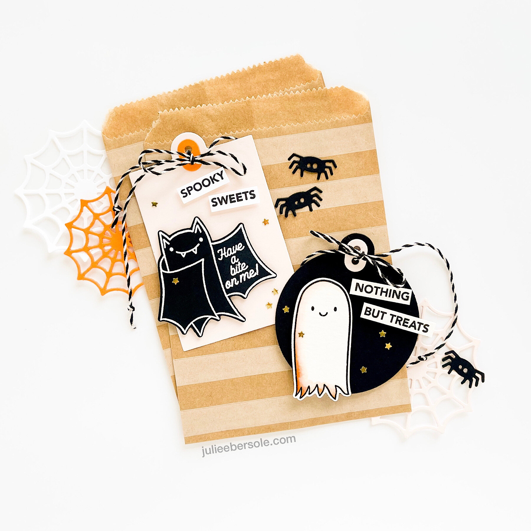
Now, I’m a gonna dish particulars about the samples above! Even tho the Halloween Treat Tags can be used as stand-alones, I really had fun combining them with the Farmhouse tags! My images were all heat embossed (the bat in white on black cardstock, ghost in black on watercolor paper, so I could do some light watercolor shading on her) There’s a double-hole punch on the Farmhouse Tags with a matching reinforcer and I love being able to use contrasting colors for the reinforcer.

Why does a project always seem more “finished” if I knot the ends of my baker’s twine??? If I don’t knot the ends, it nags at me. Baker’s Twine in particular, must.be.knotted. I think it’s an OCD thing with me . . .

2021-Sept-farmhousetags-treattags-03.jpg

Tiny gold stars make anything feel more special, am I right? I can never resist adding a light sprinkle of them whenever I can . . . I know they look like they were placed completely at random, but I kid you not, I place each one very deliberately, looking for balance overall and when I’m satisfied, I then glue them into place.

Surely I’m not the only one who futzes over such details . . . ?

P.S. If you want to see the entire 2021 EBE Fall Release, check out the release page HERE. The inspiration samples for the release page are nothing short of MIND-BLOWING GOODNESS, and were all created by my girl Heather Meeson. If you don’t already follow her on Instagram, you really should. You really, really should.


EBE SUMMER OF STAMPING WEEK 4 RELEASE NOW LIVE

Summer of Stamping Week 4 release is available now in the shop! Check out our Instagram Hop, beginning HERE, for tons more inspo and opportunities to win prizes! Leave some comment love at each stop along the way to throw your name into the giveaways hat!

Below, I’m highlighting Everything’s Beachy and the new hot foil stamp “Good Vibes Only” in my projects today!

As in pretty much all my card-making of late, I’ve been watercoloring everything—if I have to color, that’s my pick. This layout isn’t anything particularly special, but it’s one of my favorites—I split that top panel where I wanted the sea and the sand to meet using one of the Landscapes Dies , and watercolored just the edges of each separately; they were popped up with a slight gap between them and I embellished with some of those clear droplets I love so much! I really dig having the sunbrella hanging off the edge there, too. Adds interest!

I used the same Landscapes Dies to create the division—but this time I went on the angle, and very lightly ink blended the beach with a hint of Shea Butter and Sand Castle. The water’s edge was gently blended with All That Jazz and then I went over part of that with Lime Rickey to create another color.

I love having the pop of colored surfboards with the surfer dude there at one end of a series of uncolored boards; I must confess it actually turned out even better IRL than what I was picturing in my head (or chicken scratch sketches, LOL!).

And this last one? I’m crazy CRAZY happy about the retro style of this brand new hot foil stamp! I just made a monochromatic background by stamping the Swirl Background in Limoncello over Sour Lemon card stock (I did have to stamp several times to get the intensity of ink color I wanted—easy with a MISTI). Man, oh man, I guess I could have taken it further, but for me just the simple gold foiling (Gemini Foil Press) right over the top of that was absolute PERFECTION!!!

I’ll be sharing more of the samples I made for the release page here on my blog this week—thanks for stopping by today and don’t forget to cruise the Instagram Hop! May the odds be ever in your favour! (grin)


If you’d like more info on products that coordinate well with the Everything’s Beachy and the Good Vibes Hot Foil Stamp, please visit the full release page HERE.

Disclosure: Yup, those are affiliate links to the products used in my projects and I make a small commission when you purchase via those links, at no extra cost to you. Thank you for buying all the things!