clean & simple

TROPICAL VIBES

Disclosure: I include affiliate links to the products used in my projects and make a small commission when you purchase via those links, at no extra dimes to you. Thank you for the support!

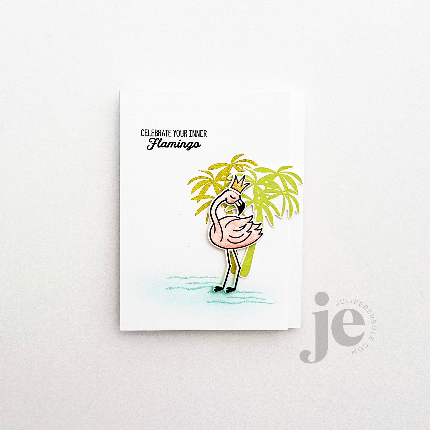
My little flamingo was black embossed onto some watercolor paper, then watercolored. She has a few palm trees behind her in this little scene. I created a two-tone effect by using Green Tea Ink on the one stamped directly on the card front, and Matcha for the die cut popped up version. By trimming about 3/8-1/2” off the long edge of the card front, I could allow the palm tree to lean right and float over that edge, which is a fun way to give the illusion of more layers to the card than there really are. I felt the crown was apropos.

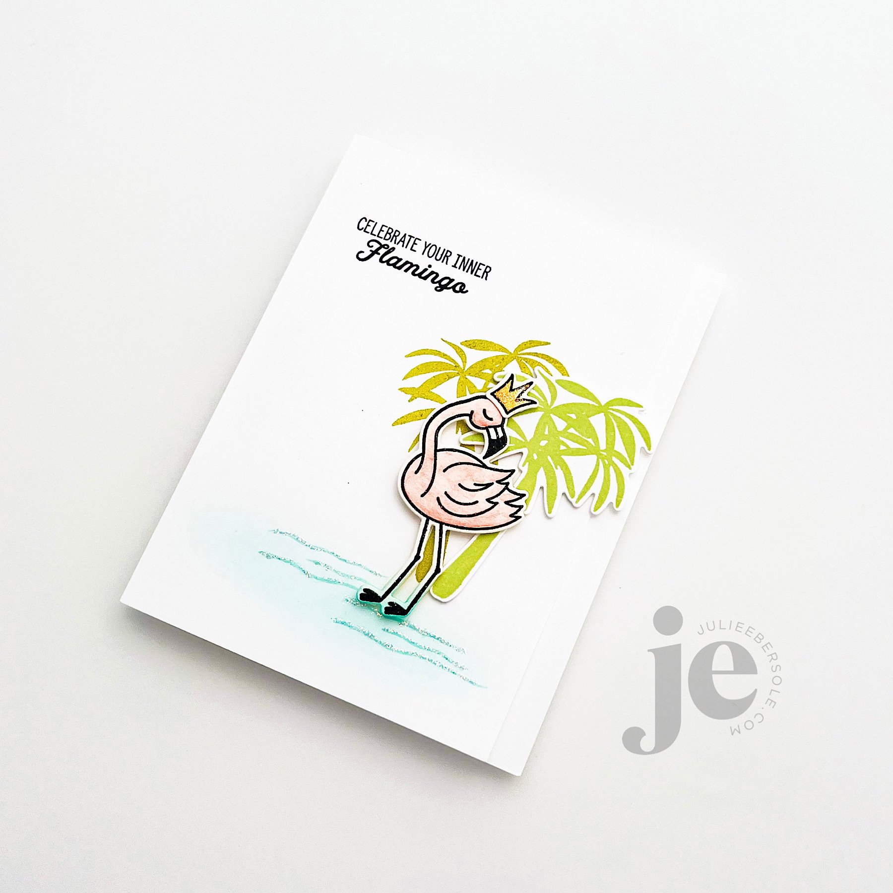
I used the same Cummerbund ink to stamp the water and then ink blend a little over top. Then, I just chose to embellish her simply, with some Stickles Diamond Glitter Glue on her crown and along the water—hard to pick up on camera, but love, LOVE that stuff! Such an easy, mess free way to add a bit of sparkle to any project. Wish it came in a jumbo size bottle!

For a pinky/peach vibe, I very lightly blended Grapefruit ink, followed by Orange Twist—with a VERY light hand. It’s very subtle and the eye picks that up more than the camera does.

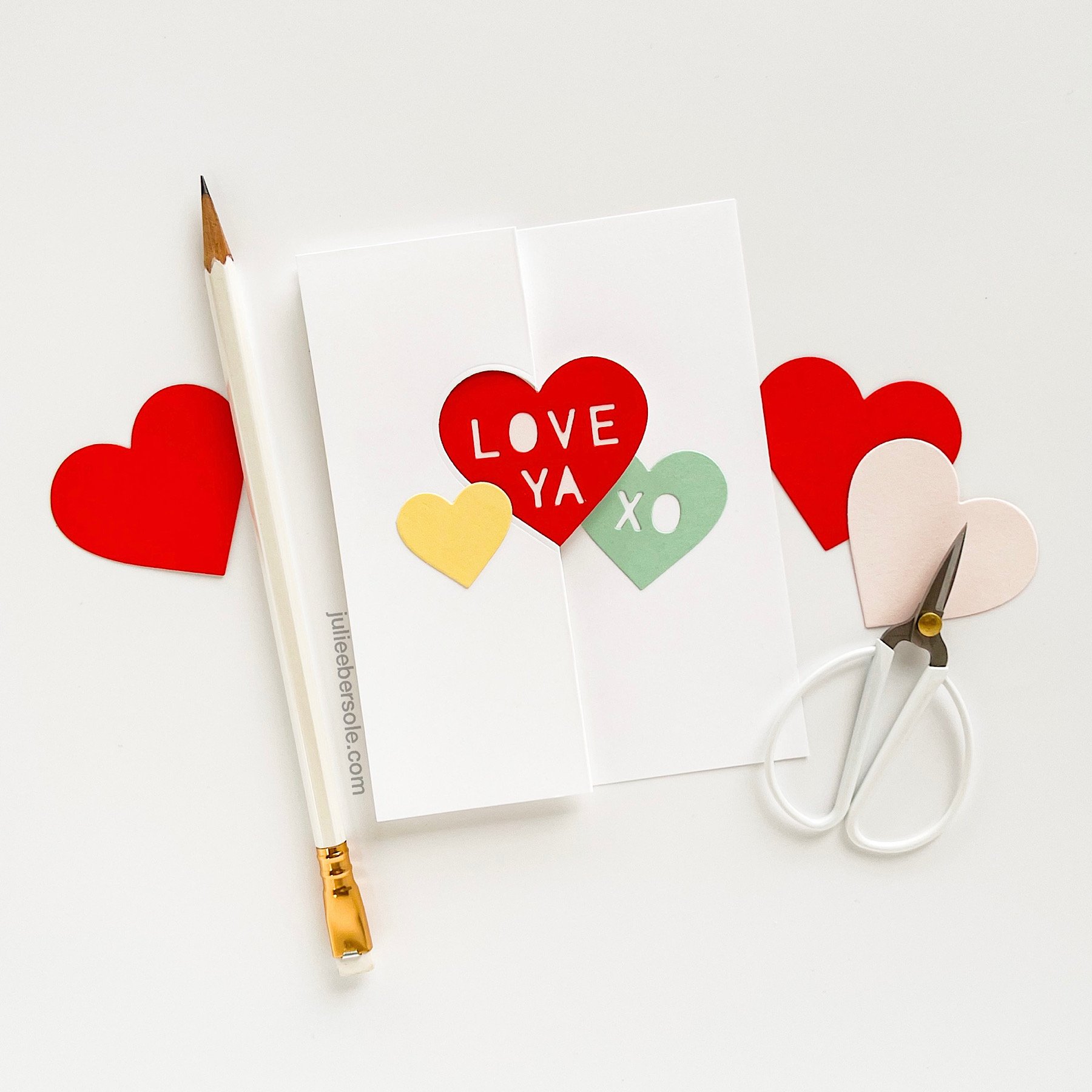
Die cutting the Aloha from different colors of card stock from the palette I was working with and just popping them up, aligning them askew from each other is casual and fun—I love how the lettering allows the pattern in the background to show through.

A natural/rustic tassel made of my favorite twine was calling out to me for this design and I couldn’t resist; I think it really sets off the island/tropical vibe I was going for!

Hope these two designs sparked some ideas for you and thanks for stopping by!

MONDO RHODODENDRON

A while back someone asked if I could add our WA state flower, the Rhododendron to the mondo floral series. This set went through many (understatement, OY!) renditions before I landed on this . . . There are about 1,000 species of Rhododendrons. 😳

How in the world are you supposed to choose ONE to translate into a stamp??? The two outside my front door are kinda scraggly looking, but the ones next to my Mother-in-law’s house are ginormous, lush things, with vibrant fuchsia coloring! Her Rhodis make me think of giant floral pom-poms, LOL!

The Gold Finch is also the WA state bird, so it seemed fitting to include her—that flash of yellow is so bright and cheerful!

Clear embossed over black pigment ink , on my favorite Canson XL Watercolor paper and then watercolored with Gansai Tambi before die cutting it out.

I like the effect of the flower itself, repeated as a background to support the focal.

This time, the Rhodi was stamped in a softer pink color, with the Gold Finch mounted over top of it and a hexagon frame cut from gold foil card stock.

If any of you are Washingtonians, I hope this set holds a special place among your stamps! Also, did you know ALL Azaleas are Rhododendrons, but not all Rhododendrons are Azaleas???

I don’t know if that’s a “fun” fact, but it’s a fact . . . ROTFLMBO!

Also, a note of thanks to those of you who left a comment or messaged me via email about my previous post . . . XO∞

You’re the bestest!!!


Disclosure: Affiliate links to the products used in my projects, that I like and use may be included; I make a small commission when you purchase via those links, at no extra cost to you. Thank you for all your support!

DESIGN DISSECTION #2

Originally, I intended this design to be a single layer. But, after creating the background, I banked left . . . slightly . . . LOL!

Read on, for the design breakdown . . .

DESIGN DISSECTION #2 • CLICK ON THE PIC TO ENBIGGAN

FURTHER NOTATIONS:

  • A 9-patch grid (indicated in aqua) helps to divide the space visually on your canvas and to guide you in placing “visual weight”. Notice how the initial pattern/design of strawberries is contained within a vertical column, down the center third, from top to bottom; this will later affect the rest of the design*.

  • Initially, I wasn’t going to pop up anything but the gold foiled sentiment and gold embossed tag line. However, they were getting lost against the strawberries in the background. To resolve that issue, I decided to add a circle die cut from vellum card stock; vellum acts as a diffuser, softening whatever is behind it. I didn’t want to soften the entire card front, I just needed more contrast in that particular area to help that sentiment stand out more.

  • On a vertical layout, it also helps to *position your sentiment, or your focal image towards the upper third or lower third, as opposed to dead center. Otherwise, it feels like the card is visually cut in half.

  • To give it even more visual oomph, I decided to pop up a trio of die cut strawberries and have them “hug” the sentiment. Odd numbers are (generally speaking) more visually pleasing to the eye, so I typically start with 3, making sure their placement balances the design so the eye doesn’t get “stuck” on one spot and has that nice triangular flow (those golden arrows).

  • I always consider metallics as part of the color scheme on a project; gold and copper can be used to warm up a card while silver tends to give off a cooler vibe.

By the way, it’s totally OK for strawberry stems to be a beautiful shade of red, instead of green; the color police are not gonna’ bust ya’. 😉

The end.

Hope the rest of your week is great!


DESIGN DISSECTION #1

In the past, I’ve posted pics of my card designs on my Instagram that included some notations and folks seemed to appreciate seeing why I did what I did, or why it works—I don’t know why I’ve never thought to share something like that here, so today, I am!

Design Dissection #1

In addition to the above notations, I’m hoping you can also see the “visual flow” of this design, highlighted with the soft pink arrows. This is a triangular path that leads the eye around the design. Even if there’s technically nothing in that upper right corner, the direction of the flower naturally draws the eye towards that area. The eye then flows down towards the left where the twine is tied into a bow. The line of that twine running across the bottom then leads the eye to the right, and “into” the card.

Side note: I usually make side-folding cards because I had so many folks who have taken my live classes tell me they preferred them over top-folding cards—side-folding cards easily remain upright when displayed. I honestly hadn’t thought much about that until they pointed it out to me! LOL!

So, what do you think? Is this helpful to you?


EASY SWING VALENTINE CARD (INTERACTIVE)

Swing (a.k.a. flip) cards have been around for a long, loooong time—nowadays, you can, of course, purchase dies that make the cuts and score lines for you, which is always nice! However, if you’ve never made one and want to give it a try, they’re quite simple/easy to do; just make sure that the shape you’re using is symmetrical (equal on both sides opposite each other, i.e. a circle, a butterfly, a square, a rectangle, an oval, a star and, in the case above, a heart) for best effect. Anything asymmetrical will be problematic.

BASIC SWING/FLIP CARD INSTRUCTIONS:

  • Start with a card base measuring 5.5 x 8.5”.

  • At 2 1/8” from the left short side, draw a faint pencil line.

  • Center a symmetrical shaped die along the pencil line and use washi tape to anchor in place.

  • Position the top cutting pad over the die and paper, aligning the edge with the pencil line; this insures that there will only be pressure applied up to that point.

  • After completing the die cut, remove die and tape and erase pencil line.

  • Score card base at 2 1/8” from the left short side (in the same position as your original pencil line), taking care not to score through the shape itself (start from the top of the card base and score right up to the top of the shape, skip over the shape, and then continue to score from the bottom of the shape down to the bottom of the card).

  • Score another line at 4.25” from the left short side (this will be the gutter/main fold) of the card.

  • Fold the card in half along the gutter, creasing well, then fold the smaller section back on itself, creating a “z-fold”.

  • As you open and close the card, the shape will swing or flip back and forth; embellish each side as desired.

  • Finished card is A-2 (4.25 x 5.5”) size when folded.

TIP:

If you plan to create a similar “Conversation Hearts” with a knock-out text effect, it helps to use alphabet dies that have extra letters, OR use phrases that don’t require multiples of the same letter. Here are some “Valentine” phrases that don’t require multiples of any given letter:

  • HUGS

  • HEY GIRL

  • WINK

  • U R HOT

  • CUTIE

  • U R LOVED

  • SWAK

  • U ROCK

  • HUG ME

  • ILYSM (Acronym for “I love you so much”)

  • SOUL MATE

  • LOVE BUG

  • XO

You’re welcome!