stamping tips

2 PUNNY VALENTINES PLUS A TUCK AND FOLD CARD

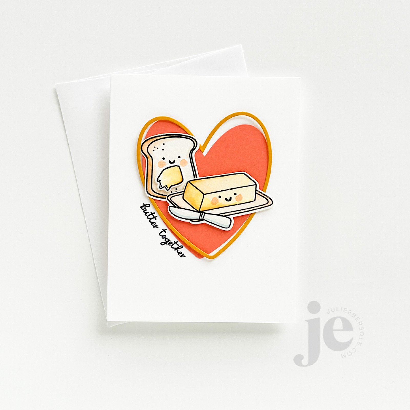
This card started as a sketch, but as I temporarily laid everything out, I felt like it needed something “more”—something small, but a little different from what I do out of habit. Originally, I had planned to white emboss the sentiment onto a strip of black card stock and work it into the layout. That’s a great stand-by that works quite well for many of my designs.

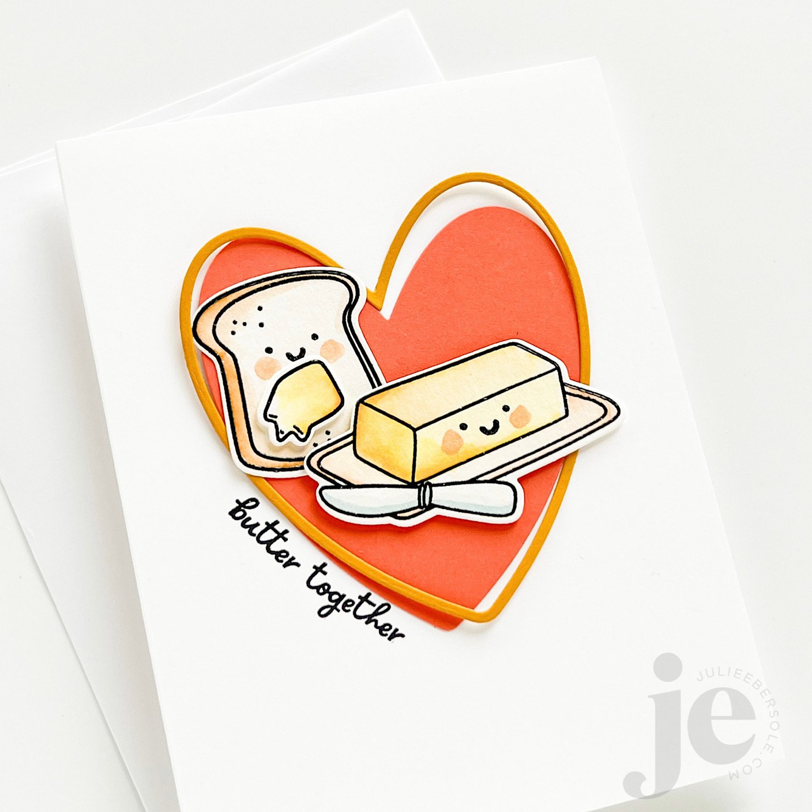
But, the idea of deviating from my stand-by, just slightly, kept nagging at me. So, I mounted the solid pink heart to the base card and then moved that to my MISTI, and curved the sentiment slightly, along the edge of the heart, got it mounted to the lid, and then inked and stamped. The golden colored frame was then mounted a little cattywampus (intentionally) with a little bit of glue in just 3 spots—I like the dimension it gives when it curves slightly up from the card front.

Everything else was clear embossed with my favorite black ink (affil) onto watercolor paper (affil), watercolored and die cut before 3D mounting into place.

Immense satisfaction achieved! (fist pump!)

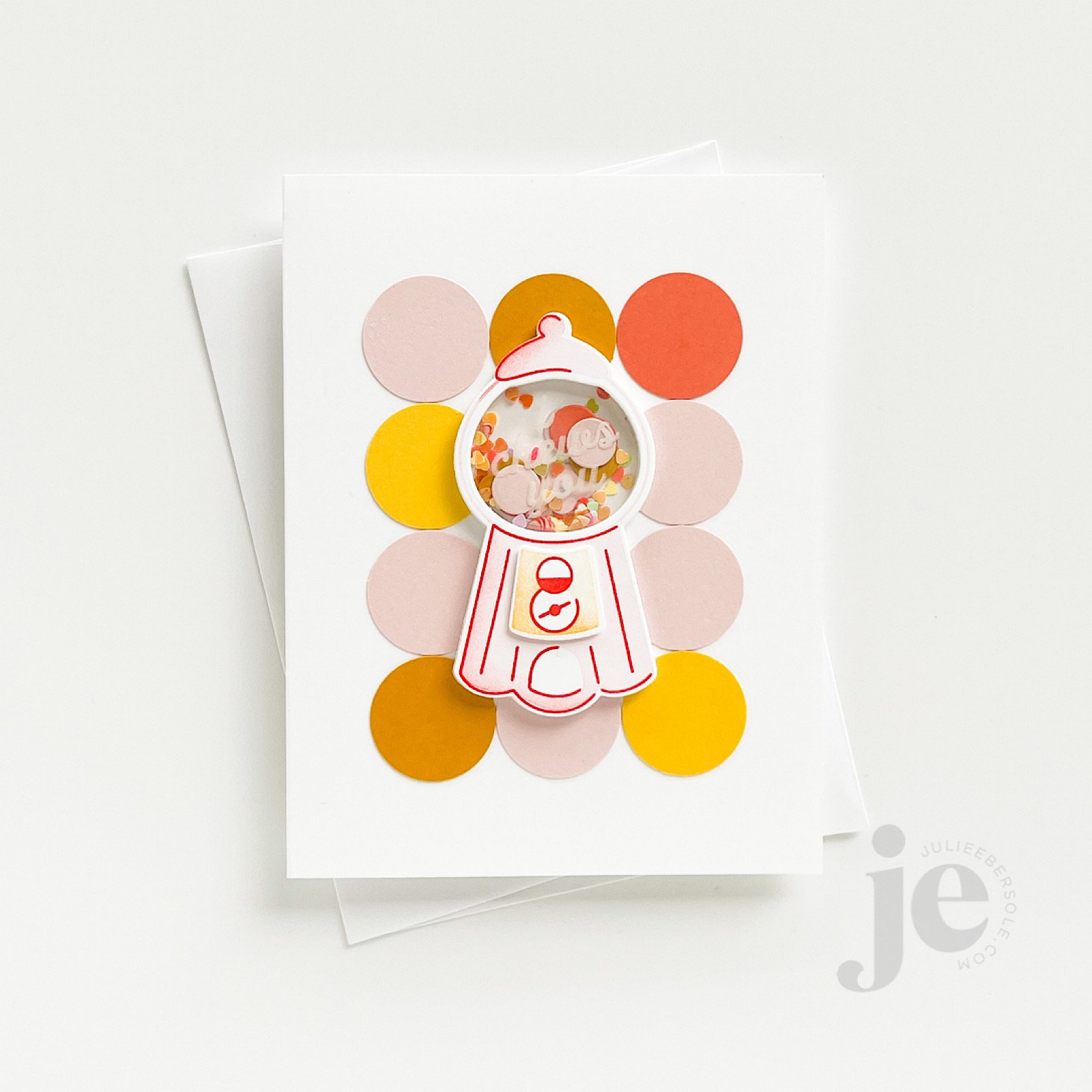
This little bubblegum machine shaker card turned out so cute! Initially, I couldn’t decide on a background/backdrop for the machine and it occurred to me to grab my 1” circle punch and just punched a bunch of “dots” from card stock in coordinating colors—I love it!

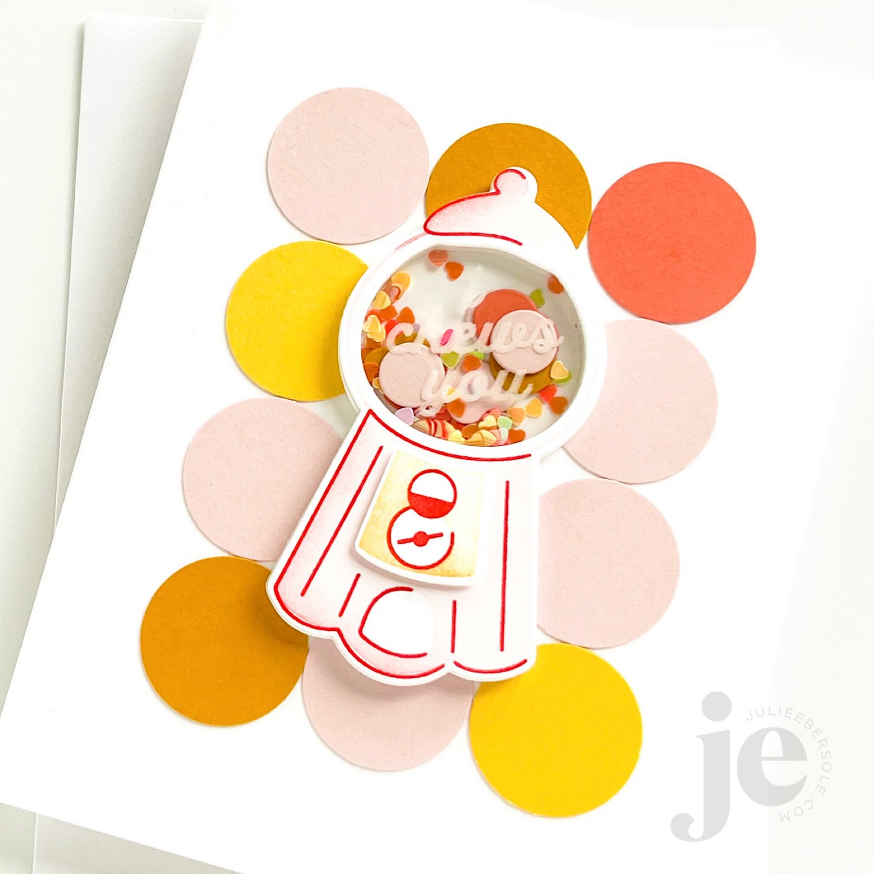
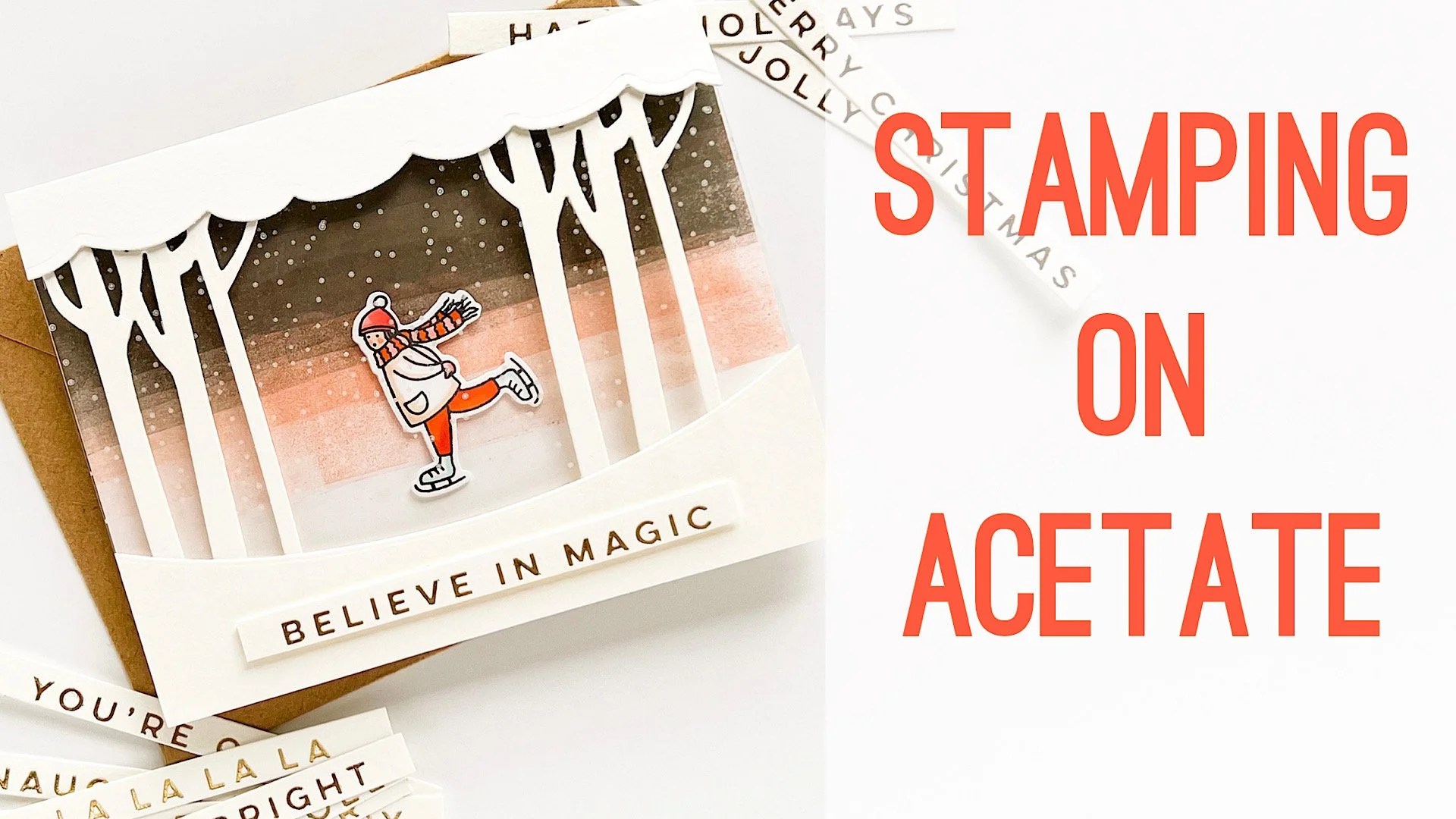
I used Staz-On Cotton White (affil) to stamp the sentiment on the Crystal Clear Plastic (affil); I probably should have heat embossed it (this acetate is heat resistant) for better visibility as it’s hard to capture it that well in a photo, but IRL, it shows more prominently. Those teeny, tiny rainbow confetti hearts (affil) were just beggin’ to be filler, so I had to do it!

Here’s a TIP:

If you don’t have any sheet size foam tape (affil) to die cut for the shaker walls, try cutting the shaker front piece 5x from 110# Neenah Solar White (EH / AMZ affil) and just layer/stack them all together with Bearly Art Glue (affil)

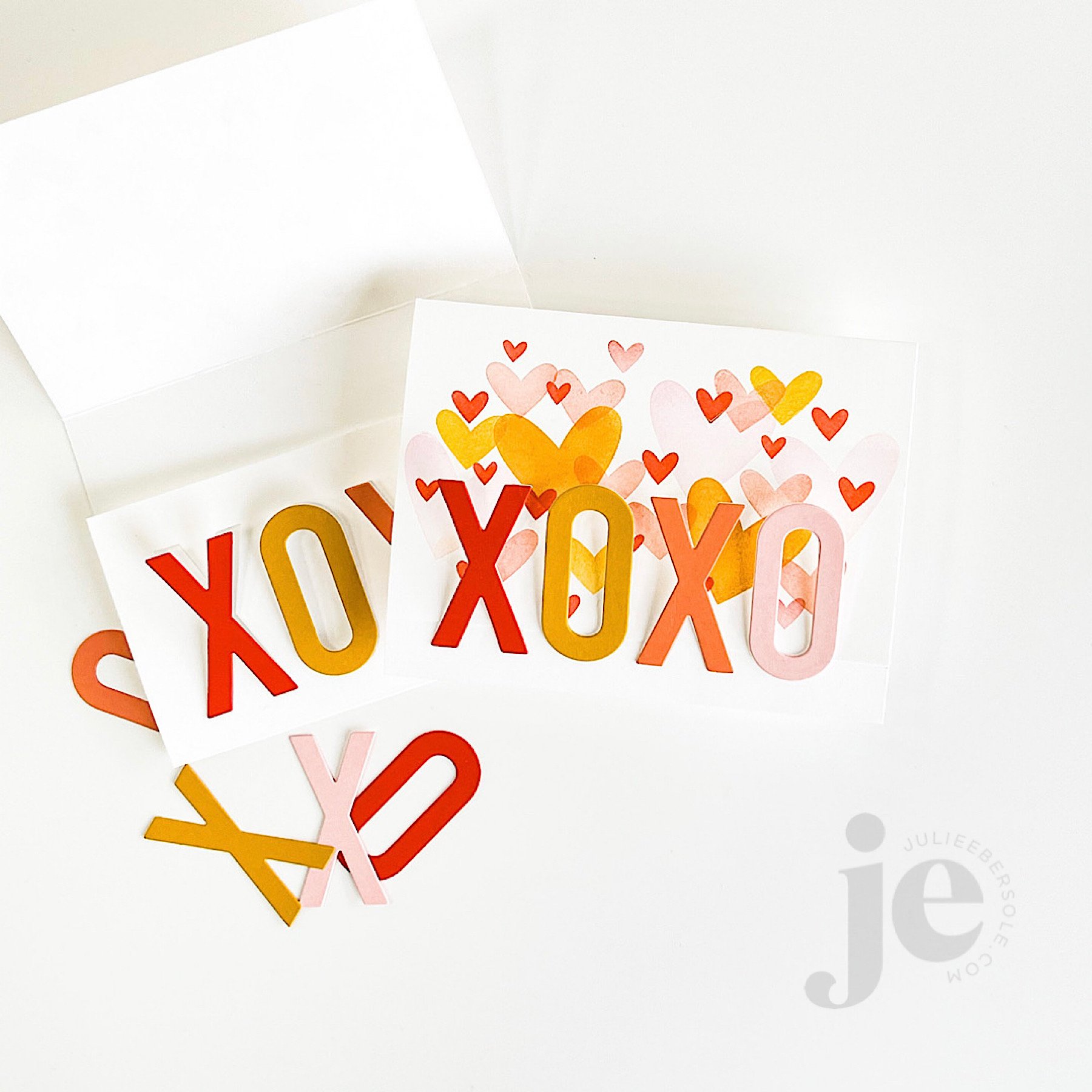
feat. BIG LOVE STAMPS (the hearts background) | XOXO DIE

This way fun “fun-fold” design is actually a tri-fold that tucks and folds! I haven’t done one of these in so long and it’s one of my favorites so I need to poke myself as a reminder to do this more often because it’s so easy and always feels “clever”.

Video Tutorial below:

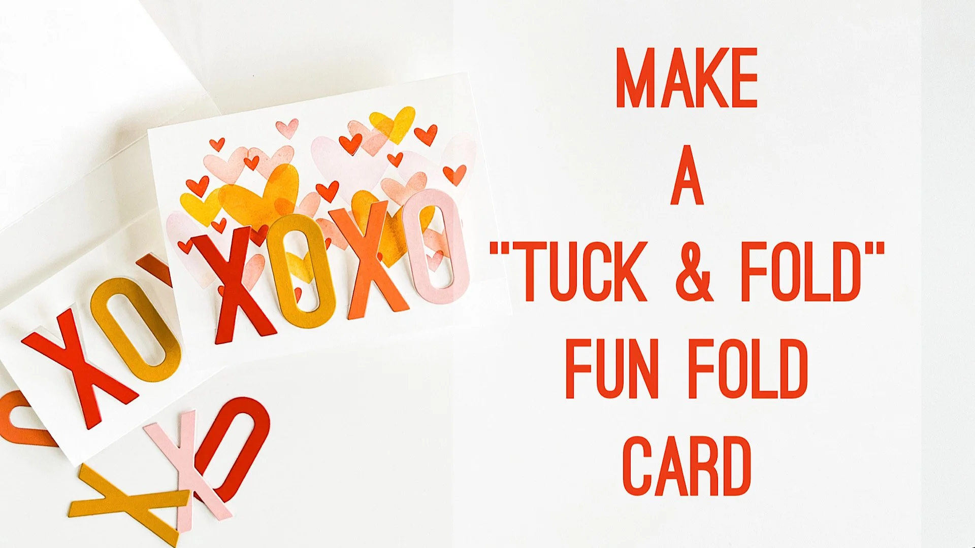
If you give this fun fold a try, you’ll have to let me know what you think! I love that it’s soooooo simple but the explosion of colors just makes it so visually impressive!

I cannot believe we are mid-way through January already; CRAZY!!!

Stay crafty!


Disclosure: I include affiliate links to the products used in my projects and make a small commission when you purchase via those links, at no extra dimes to you. 🙂 Your support is appreciated more than I can say!

OTHER SUPPLIES

The color palette I used for these samples:

Tools:

Embellishments:

Miscellaneous:

HOW TO STAMP ON ACETATE

Stamping on acetate (I use Ellen Hutson's Crystal Clear Plastic) used to one of those things that caused me some anxiety and stress, even tho I loved the end result—you had to make sure you didn’t slide around on the slippery surface and ruin the impression. I would hover, double check that my pinkie fingers were anchored to steady my hands, hold my breath and hope that the impression would land specifically where I wanted it. Sometimes it did, sometimes no worky . . .

The MISTI changed all that. If you still do not have one of these, I highly recommend getting the original/standard platform. I think it’s the most versatile size but still compact enough to not overwhelm your work surface. I also own the Mini MISTI, which is so awesome for stamping a quick sentiment on a card front, but when I need to reposition the paper or the stamp, the size of the original makes it a whole lot easier.

TIP: The snow dome above, from CHRISTMAS MAGIC, was die cut out after the stamping had dried. I like to use washi tape to anchor the die down to the Crystal Clear Plastic, but I’m careful to avoid placing the tape anywhere where it might in advertently “lift” any of the ink off. I suppose I should test that theory to see whether or not it this ink does hold up to sticky stuff, but I figure why take the chance when you can avoid it anyway? (insert shoulder shrug)

In hindsight, after filming the video below, I realized you might have seen the stamping better if I had removed the protective tissue that is sandwiched between each sheet of Crystal Clear Plastic (It comes that way in the packaging and I always leave it on the sheet when I’m trimming it down to size to avoid scratches), but as I progress through this particular project, you’ll get some good looks at how the snow actually looks and the difference between the original card, and the duplicate I made to show the technique.

Skater image from SNOW MUCH FUN . Sentiments from HOLIDAY CHEER HOT FOIL STAMPS

Here, I used the smaller dome in the set to make a snowy acetate window for a traditional style shaker card. It’s a really fun way to dress up your shaker windows with very minimal effort!

MORE TIPS:

  • Use a MISTI; seriously, the magnet holds your acetate in place and really helps you get crisp, clean impressions, without sliding all over the place. Makes a HUGE difference in ease. Ask me how I know . . . !

  • Use an ink that is permanent on slick surfaces; I love Staz-On inks, and their Opaque Cotton White EH / AMZ has been a favorite of mine for years and years! Keep in mind that this ink is specifically formulated for things like acetate/non-porous surfaces and does not show up well on paper.

  • Staz-On Opaque Cotton White ink EH / AMZ comes with it’s own reinker bottle; you load the ink pad yourself. Shake the bottle well before loading the pad; I often use a plastic butter knife to spread the ink evenly across the surface and “work it” down into the pad foam. If you “over-ink” the pad, things can get really thick/gunky on the stamp, become super slippery and take a while to dry. I get best results when pad is inked enough to be slightly “tacky”, but not slippery.

  • You made a mistake or got an ugly impression; it’s gonna be OK — don’t mess yer dress!!! Use a rubbing alcohol prep pad (First Aid aisle at the grocery store/pharmacy, etc.) to clean the ink off and try again. Yup! You can totally do that! HUZZAH!!! (virtual high 5)

  • Use a heat-resistant acetate, like Ellen Hutson’s Crystal Clear Plastic ; you can heat emboss and hot foil stamp on it! BONUS!!!

  • Staz-On has a tendency to “stain” your stamps. If you find it bothersome, try using a cleaner like Ultra-Clean to remove.


Disclosure: I include affiliate links to the products used in my projects and make a small commission when you purchase via those links, at no extra dimes to you. 🙂 Thank you for buying all the things!

SUPPLIES MENTIONED:

3 STARRY SKIES IDEAS

Honestly, I am not an outdoorsy girl; the family is always teasing me that I need to “get out of the bubble” more often. Which would probably do wonders for my legs, which could use a lot more sun, LOL!

But, I was feeling the nature themes when illustrating and designing for this particular summer release and remembering how last year, we laid out on an airbed in the backyard and gazed up at the night sky, watching the Perseids shoot by . . . Yeah, for real.

Our house is surrounded by very tall evergreen trees, and there are no street lamps in our neighborhood, making it a perfect setting. I used my trusty Speedball brayer to create the sky background, using some dye inks by Concord & 9th (Grapefruit, Stardust ) and Catherine Pooler (Juniper Mist)

TIPS

  • When loading your brayer with ink, always roll and lift, roll and lift (continuous motion), to make sure you get the brayer inked all the way around. Make sure to place scratch paper underneath or you’ll end up with ink all over your work surface. Ask me how I know . . . (face palm)

  • Using the same method of rolling and lifting begin to brayer with your lightest color first, start off the project and roll onto the paper surface, to avoid odd marks to the paper; continue until the brayer goes completely across and off project, onto the scratch paper. If you don’t, you won’t get complete edge-to-edge coverage. Of course, if you don’t want edge-to-edge coverage, disregard.

  • Any excess ink on the brayer can be rolled off onto the scratch paper and then you can load with the next color. You probably won’t need to wash the brayer off until you’re completely done with the last, and darkest, ink color. Less clean-up. Sweet!

  • Want to heat emboss over the top? Well, you can let it sit for a while, OR, if you’re like me (impatient), use your heat gun to “dry” the surface, then pounce it with an anti-static pouch to neutralize any moisture, like oil or lotion from your hands.

  • Blow off or use a soft brush to flick away any excess anti-static powder sitting on the paper surface, then stamp and heat emboss. Why? Because if you don’t, as you press your Versamark inked stamp against the paper, it will collect that excess powder with every impression and transfer it to your Versamark pad when you go to ink up your stamp again. As the powder accumulates into your ink pad, it will become less and less sticky; ink pad no worky after a while!

I had a rare flash of brilliance when designing the Through The Trees die, so you could create two different effects. Using one shape makes it appear you’re looking over a row of trees, but cutting it twice and mounting the two opposite each other creates the visual effect of being in a clearing, surrounded completely by trees, looking up through them at the sky. I really, REALLY love that . . .

Before doing all the white heat embossing, I used a blending brush to apply the Juniper Mist ink around the outer edge of a navy blue panel—it draws the eye towards the sentiment in the center there, and gives it a glowing effect, to emphasize it even more. You could also use black ink, but, I didn’t have any that wasn’t permanent/archival and I really didn’t want to ruin a blender brush with permanent black ink. Just sayin’ . . .

When you don’t have the color of card stock you need in your stash, you can make your own.

MORE TIPS

  • Use a blending brush/tool and ink to coat white or short cut your blending by starting with a colored card stock as your base, to get the color you need.

  • Distress Oxide Ink will give the most opaque coloring; I often use that on 110# Neenah or colored card stocks because it’s a lot less work than using dye inks. Just sayin’ . . . A girl with tendinitis in her arm needs all the help she can get!

  • Depending on the look you’re going for, try watercoloring over a panel of watercolor paper, and die cutting from that after it’s completely dry.

DAAAANG!!! If you’ve made it to the end, you’re a trooper and I hope you got at least one tip or idea you can use!

That’s all I got for now. Thanks for poppin’ in!


Disclosure: Affiliate links to the products used in my projects, that I like and use may be included; I make a small commission when you purchase via those links, at no extra cost to you. Thank you for all your support!

HOW TO OMBRE INK DIRECTLY ON YOUR SOLID STAMPS

That beautiful variegated or ombré ink effect is a wonderful look when combined with solid stamps. You can achieve it by blending ink colors directly on the stamp surface! I’m working with water-based dye inks and using a MISTI positioning tool; for this method, a positioner is key to being able to stamp precisely over the original impression multiple times.

VIDEO

HOW TO:

  1. Select 2-3 shades of ink in the same hue, ranging from light/pale to dark (for really large stamps, you may want 3-5 variations of ink color, but for stamps the size used in this project, 2 is plenty).

  2. Ink stamp with lightest color first and impress to paper; if mass producing and die cutting images out, try my suggestion of trimming quarter sheets of card stock even further down into smaller pieces so you only have to rotate those pieces and not reposition the stamp in order to maximize the paper.

  3. Use the darker color to ink only a portion or a side of the stamp where you want shading or deeper color.

  4. Use a blending tool, like the Little Smoothie, to rock or pounce the rounded end of the sponge across the edge of the ink to soften. Stamp over original impression.

  5. Repeat Step 4 as often as desired.

  6. Highly contrasting colors of ink may require you to clean the stamp before switching colors to avoid cross-contamination of ink pads.


All the beautiful shades of ink pads out there make this one of the easiest methods for achieving “multi-colored” images, especially when working with solid stamps!

Thanks for stopping by!


SUPPLIES:

Disclosure: Affiliate links to the products used in my projects, that I like and use may be included; I make a small commission when you purchase via those links, at no extra cost to you. Thank you for all your support!